Reflecting on "A Multi-Level Typology of Abstract Visualization Tasks"
The IEEE VIS 2023 10-Year Test of Time Award
I want to thank the IEEE VIS community for recognizing the value of this work.
At the outset of my doctoral studies, I aspired to make a methodological contribution to the field of visualization: to rethink how we evaluate visualization experiences beyond controlled experiments of response time and accuracy, to introduce a qualitative approach leveraging my background in HCI and cognitive science.
The challenge I faced was that an evaluation should result in implications applicable beyond a single application domain. This challenge manifested in the first two projects of my PhD as a lack of a consistent code set for abstractly describing why and how people visualize data. Because of this challenge, these projects stalled.
It turned out that Tamara also faced this challenge in the process of writing her book.
In response, I set out to read everything related to tasks, interactions, insights, both communicative and analytical goals with respect to visualization. While this literature survey is represented in the paper, the other and more exhaustive forms of this literature review include an annotated bibliography appearing in my dissertation and an interactive wiki, which is still accessible today at mattbrehmer.ca/wiki.
The paper followed several months of intense diagramming, white-boarding, and marathon one-on-one meetings with Tamara. The paper was originally titled Mid-level tasks for Visualization Design and Evaluation, aiming to fill the gap between prior high- and low-level classifications. This evolved into the Multi-Level Taxonomy of Abstract Visualization Tasks, and thanks to a knowledgeable reviewer who pointed out the difference between an exhaustive taxonomy of objectively observable entities and a typology of abstract classes, we finally settled on A Multi-Level Typology….
InfoVis 2013 was our first attempt at submitting this work, and the reviews were mixed but leaning positive, with scores 3, 3, 4, and 5, with a summary score of 3. The primary reviewer wrote: “The InfoVis conference might not be the best avenue to deliver this work. A journal article (such as a regular TVCG paper and InfoVis journal) might be better venues.” However, with a strong revision and cover letter, we managed to win them over.
Presenting this work was my first time speaking at VIS. I still recall the session well. I presented last, following two other thematically similar presentations by Robert Roth and Hans-Jorg Schülz. The session chair was Bongshin Lee, who I would later collaborate with extensively. After my presentation, first to the microphone to comment were Ben Shneiderman and my Tableau future colleague Jock Mackinlay. Talk about intimidating for a newcomer to VIS! Both expressed enthusiastic appreciation for the work, for which I’m grateful.
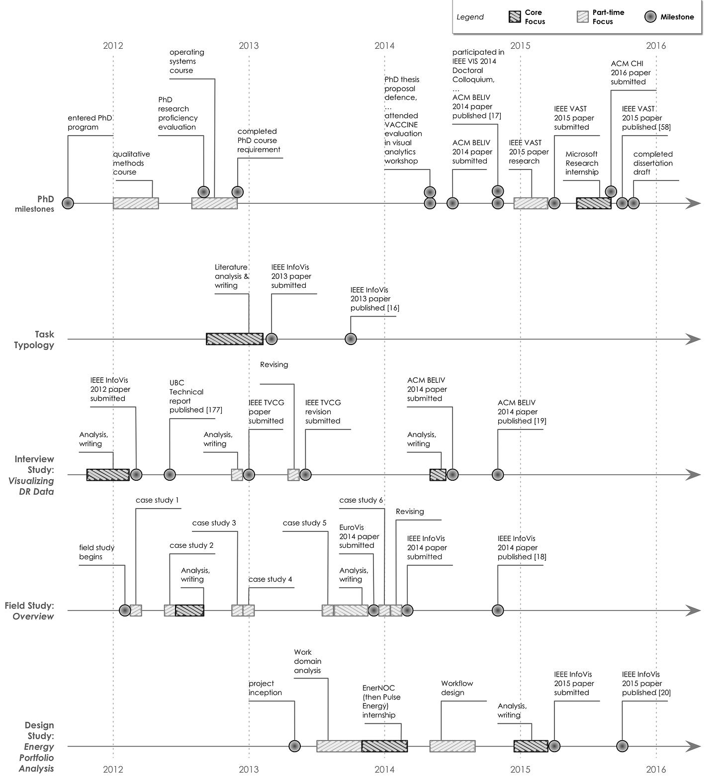
In addition to its later incarnation in Tamara’s book, this typology would also be the backbone of my dissertation work (see the chronology diagram). I used it in two evaluation studies presented at VIS 2014, and in a design study presented at VIS 2015. Since graduating, this typology has also informed my subsequent work and collaborations, from contextualizing experimental tasks at VIS 2018 to a grammar for specifying dashboards at VIS 2020, and most recently with respect to Tableau Research’s open source Visual Analytic Intent Language.
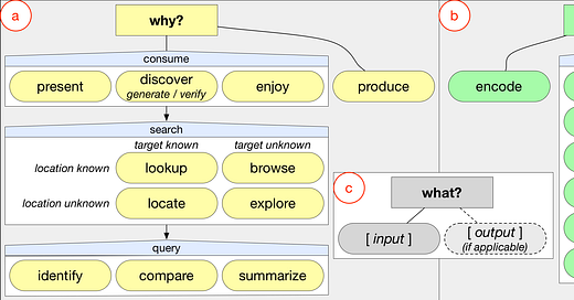
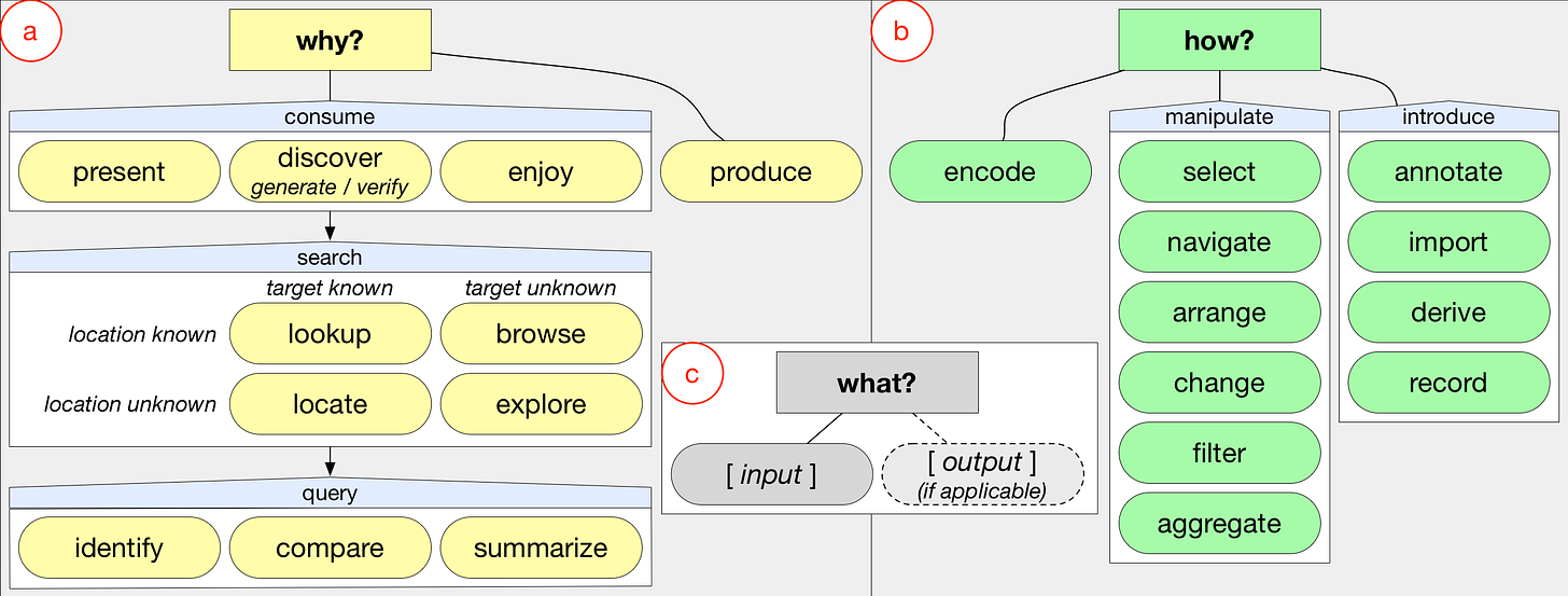
At the end of my dissertation, I reflected on the impact of this work and how others in the community had used it in their work between 2013 and 2016. I suspect this is still true in the years since, but I observed that by citing this work, many people were citing the terms used in Figure 1 and Table 1: the classification of why and how people visualize data. I would challenge new readers of this paper to read beyond Figure 1 to learn about how to use the typology in the context of sequential and hierarchical task analysis, which I demonstrate in the other papers of my PhD.

A final reflection. This paper was directed at the visualization community. It is not very accessible to newcomers. The summary reviewer stated “It would be difficult to understand for the people who are new to this topic.” Neither is the paper very friendly if you’re a practitioner. It prompted my Tableau colleague, Iron Viz host, and author of The Big Book of Dashboards Andy Cotgreave to ask in a tweet “Why is the language so intentionally obtuse?” Sorry, Andy. He would later add: “Don't get me wrong, the info is generally utterly fascinating, but some of the conventions feel like barriers.” We can and must do better as a field to ensure that our papers have reach beyond visualization researchers.
I’d like to thank many people who provided ideas, feedback, and support related to this work: the UBC InfoVis Group circa 2011 – 13 (Stephen Ingram, Miriah Meyer, Michael Sedlmair, Jessica Dawson, and Joel Ferstay), my co-advisor Joanna McGrenere, Ron Rensink, Colin Ware, Silvia Miksch, the InfoVis reviewers, Tamara (or course), and lastly my partner and colleague Ana Crisan.


